Design in Data Figures: The Ratio of Data-to-Non-Data
Introduction
The estimated number of people who suffer from severe claustrophobia is anywhere from 2 to 10%. Of course, many more likely suffer from mild forms of claustrophobia. Although I’m usually okay in caves, packed metros, and tight slot canyons, I once started getting a little anxious after I was stuck in a small, rickety elevator in Russia for 3 hours. It might have been more related to the amount of time I was stuck than the small available space, but my heart rate and temperature were climbing.
Unfortunately, data figures can potentially cause similar claustrophobic symptoms: a desire to get away, a rise in blood pressure, and nausea (at least metaphorically). These symptoms are in fact caused by a variety of health conditions (and attributes of bad data figures) but today I want to discuss the cramped and tight spacing of data figures that cause, at least at a subconscious level, revulsion in me and probably in many viewers.
Examples
First of all, take a quick look and skim only the next four figures below. They each have the same data presented in a scatter plot of weight versus horsepower of various passenger vehicles. There is also a first-order polynomial fit line of the same data with the confidence region in blue which is overlaid. You might already see potential issues discussed previously (here) and other problems, like no units presented on the axes’ labels, but today we’ll focus on the relative extent and space used by the data on the figure. More specifically, I want to call your attention to the ratio of pixels (or ink if it was printed) dedicated for the data to the pixels (or ink) dedicated to all the other stuff that helps one understand the data (i.e. the non-data). I’ll call this the “data-to-not-data ratio.”
Now, let’s discuss them one a time. Consider Figure A.

Figure A
In Figure A, the data points are presented as small specks. On the other hand, the axes are big and bold and are admittedly easy to read. The grid lines do help guide the eye for a specific value check of a particular vehicle but it’s almost as if the creator of this figure wants the data to remain hidden and hard to access. What are they hiding? Essentially the ratio of data-to-not-data in this figure is very small. If printed, the amount of ink used for the data is almost nothing compared to the ink required for the axes, labels, frame, and gridlines. As much as they are needed, we don’t look at a data figure to enjoy the beautiful axes. Those are really secondary. Don’t misunderstand – axes are essential for calibration, context, and comparisons, but the data are the real reason we came to this figure in the first place. Thus, usually one has presented a good figure if the axes are quickly consulted (almost subconsciously) and then the axes effectively stay out of the way of the data. Figure A has two axes that are packed with numbers and letters (and pixels) taking up a majority of this figure.
Let’s look at a different one: Figure B

Figure B
In Figure B, the ratio of data-to-not-data has clearly increased in comparison. One’s gaze is now first drawn to the data more than the axes. That’s an improvement over Figure A. But the data points are cramped, too tight, and even occluding one another. The axes are still packed as before with no extra room. This figure can’t breathe. It’s claustrophobic - or at a minimum, it could induce nausea in observers.
Onto the next combination to explore: Figure C.

Figure C
The data-to-not-data ratio is now super high in Figure C. But is it too high? We do indeed see the data points but we might have trouble making sense of the data without legible axes. The claustrophobia in Figure C is now just in the data points and not in the axes. There is still a lot of data occlusion and since the points are so large looking up individual values against the axes, especially in the crowded regions, is cognitively taxing and borders on impossible. The axes numbers and labels might still be legible at some resolutions and on some devices, but the balance is clearly off.
Finally, the last combination, Figure D.

Figure D
We’re back to a much lower data-to-not-data ratio, and therefore it takes some time to discover what we should be looking at, but now we also need to think about “white space.” Previously, I mentioned that the “not-data” stuff is the ink or pixels used for the axes, labels, etc. But it’s sometimes a good idea to consider everything that isn’t data, to be the “non-data” including the white space in and around the data points. With that perspective, Figure D is too bare, with a very small data-to-not-data ratio. Of course, I added in the best fit line for better comparisons between all the above figures but if that fit line was removed, we’d be looking at something close to a blank figure.
A more reasonable data-to-not-data figure is presented below in Figure E.
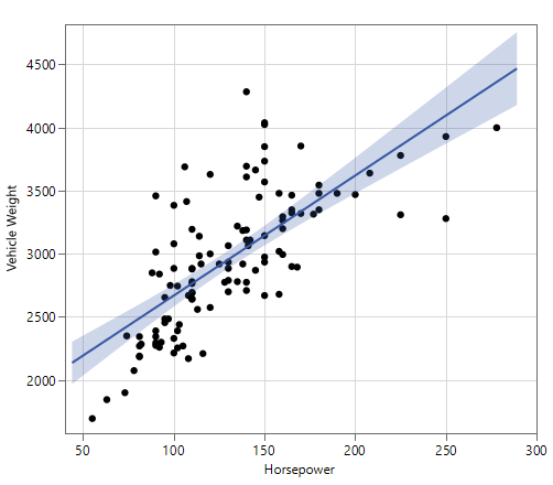
Figure E
The data in Figure E takes a slightly higher priority over everything else in terms of attention. The data is bold and clear, and although there is some occlusion for a few of the data points, that effect is generally minimized because removing occlusion completely would require making the data points too small as they were in previous figures. Of course, if the creator of this figure wanted the reader to see an individual data point within one of the occlusion clusters, then they should use shapes, colors, and other techniques. Therefore, there might be a compelling reason to move to a lower or higher data-to-not-data ratio but that would depend on the intended takeaways of a given figure.
Conclusion
The data-to-not-data ratio is not the only thing that one has to think about when designing a useful and effective figure. There are obviously exceptions to the above guidelines but among the many things to consider always ask yourself: What percentage of my figure should be data to best present my results? Or conversely, what percentage should be non-data? That one question will go a long way to make better designed, and more readable, figures.
Practice
Time to practice. What do you think is good or bad about the following figures in terms of the data-to-not-data ratios?


To cite this article:
Salmon, John. “Design in Data Figures: The Ratio of Data-to-Non-Data.” The BYU Design Review, 31 Jul. 2020, https://www.designreview.byu.edu/collections/design-in-data-figures-the-ratio-of-data-to-non-data.