
Design in Data Figures: Dealing with Occlusion
I’ve recently been reviewing a number of manuscripts by students and researchers. Some of these manuscripts are submissions to academic journals and sometimes they are dissertations or theses. During the last semester I was also reviewing and grading presentations, projects, and homework assignments for the different course projects.
I find that aspects of my feedback are often repeated. That is, I’m writing and sharing the same thing with multiple people, both professionals and students, time and time again.
One of those aspects is dealing with data occlusion in figures.
Data occlusion occurs when the reader can’t discern between specific data points one is trying to present in a figure due to other data hiding it in some way. For example, two or more data points might be directly on top of each other such that one or more data points below are hidden or occluded. Figure 1a shows 10 data points - of course, you and I only see five distinct points because there are repeated points that are occluding another. (See Figure ab). Replicability, with multiple repetitions, are one of the hallmarks of the scientific method and thus there is a real potential of having the response or output of some model or test result be the same value. Although this can happen with continuous outputs, occlusion often occurs when outputs are discrete values (e.g. the whole number results of fixed-sized solar panels needed to power a system) and where the number of design variables is large (i.e. input variable 1, input variable 2, …, input variable 10, etc.) but only the effect of one input variable can be presented at a time on a simple 2D figure. Thus, although only one input variable is shown in Figures 1a and 1b, there may be many more input variables that were different that ultimately resulted in a similar output.
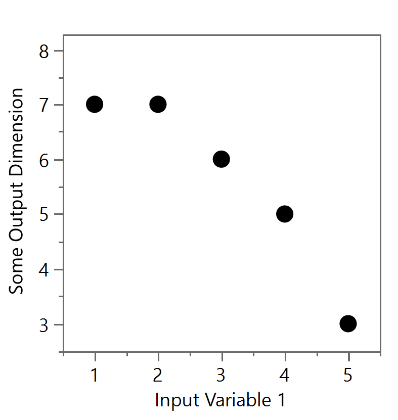
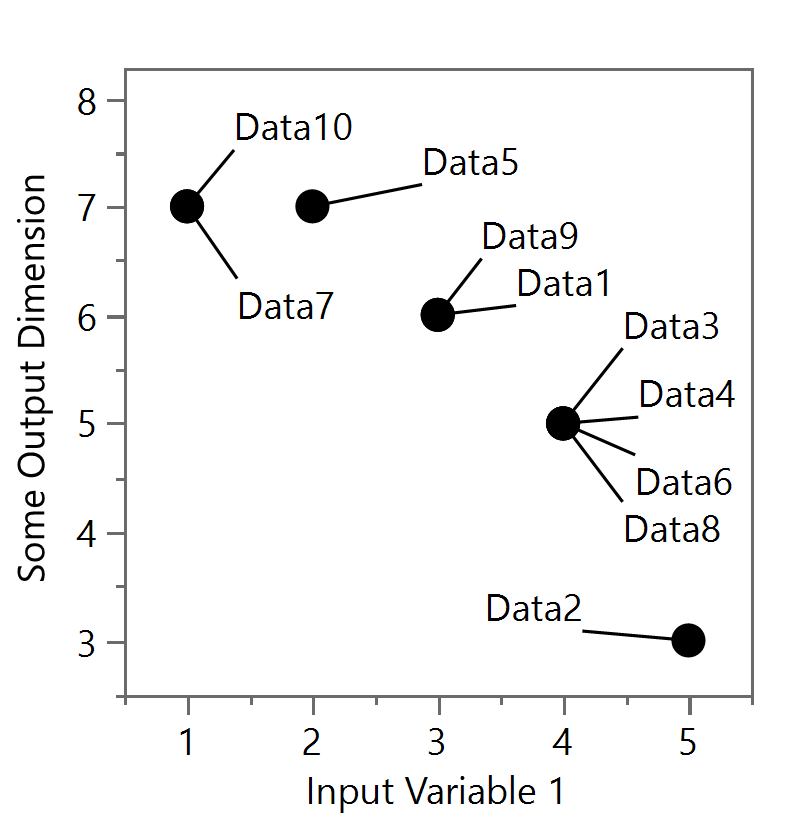
Figure 1a and Figure 1b
The problem with occlusion is also evident when a large number of data points are presented on the same figure, such as from extensive tests that randomized the inputs, related to Monte Carlo Simulations, that explore the design space in different ways. In Figure 2, exactly 10,000 data points are shown. A reader wouldn’t be able to tell the relative density and positioning of those data points in the bottom left corner because the round symbols or dots themselves are overlapping each other. A lot of the data is occluded.

Figure 2
To illustrate this further, I’ve removed exactly half of all the data points (i.e. 5000) from Figure 2 and present the remaining 5000 is Figure 3 below. Despite what you might think, this is a completely different figure, but because of data occlusion they appear identical. There are sufficient data points to cover the lower left portion in the same way.

Figure 3
So, how does one solve this problem? One way is to simply decrease the size of the data points. Let’s look at both figures when one uses smaller symbols or dots (compare Figure 3 to Figure 4).

Figure 4

Figure 5
In Figure 5, the 5000 points which were (selectively) removed from that bottom left section now show a “hole” in the data with respect to Figure 4. A reader can indeed see a little bit better where the distribution of data points fell within the figure but there clearly is still some occlusion going on at other places. Of course, one can always decrease the point or symbol size, but there is a limit. After all, the points have to be a least one pixel in size (for rasterized images). Vectorized images can allow the points to be even smaller than one pixel, but typically one will want to evaluate the figure at the normal reader’s size or at the resolution of computer monitors (even if a printers can print at finer resolutions).
Usually, since these types of figures are presenting “data in bulk,” or the extent of the output space with respect to some constraint or general trends of possible designs, individual data points are often not necessary to discriminate from one another. In that case, a contour plot showing the density of data can be considered (see Figure 6). These contour plots can show where data points would likely be found overall and overcomes some of the occlusion effects. However, the downside is that individual data points in low density regions are “washed out” and almost invisible (i.e. see the upper left and lower right sections).
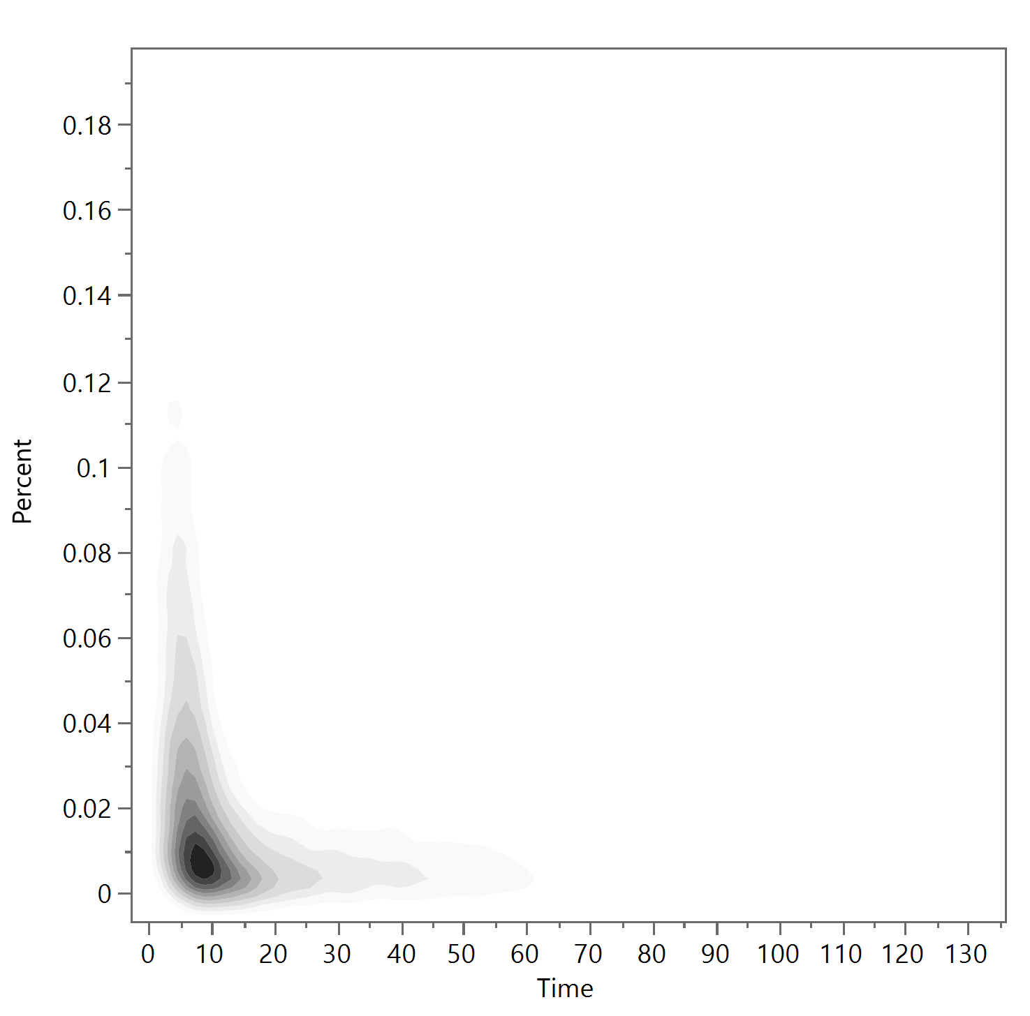
Figure 6
Since often we are interested in identifying the off-nominal or extreme points of the output space, a selected few points can be added in as representative of the design boundaries of what can be expected. (See Figure 7). These boundaries points are the dominating points of a distribution, that is, no data point is found above/below or to the left/right of these border points. The cognitive load of understanding these types of figures can be higher and may require additional text if the reader is unfamiliar with these visualizations. Also, these boundaries points are marked in red x’s but they could be designated in other colors or symbols. However, even these x symbols show some occlusion at the bottom left where there is some overlap between these dominating points as well.

Figure 7
If showing the individual points are still necessary based on the intended message of the figure, then transparency of the points can also be considered to help with occlusion. Compare Figure 8 to Figure 9, where the transparency of each data point is set at 0.1 or 0.02, respectively. In Figure 8, it takes a stack of 10 data points to reach the same hue of one black data point as before. In Figure 9, it takes 50. Again, the downside is that the outlier points are harder to see, but the main bulge at the bottom left is more clearly defined. If using this technique, choosing a software where you can iterate with this parameter is highly recommended.

Figure 8
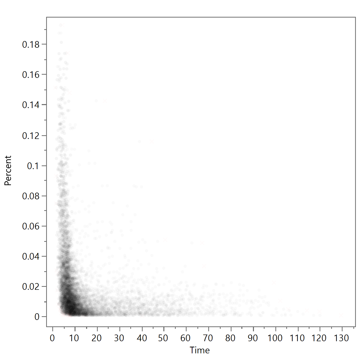
Figure 9
Now let’s turn back to the original data set of 10 points. There are a couple of ways to deal with this kind of occlusion. First, consider the use of transparency in Figure 10a. Although the reader might be guided through lengthy explanations that there is indeed overlapping data at the darker spots, it’s more likely they will interpret these shades as categorical data (i.e. encoding more information into the shade, like one might with colors as shown in Figure 10b). Thus, using transparency is generally recommended for when the data is much more dense.
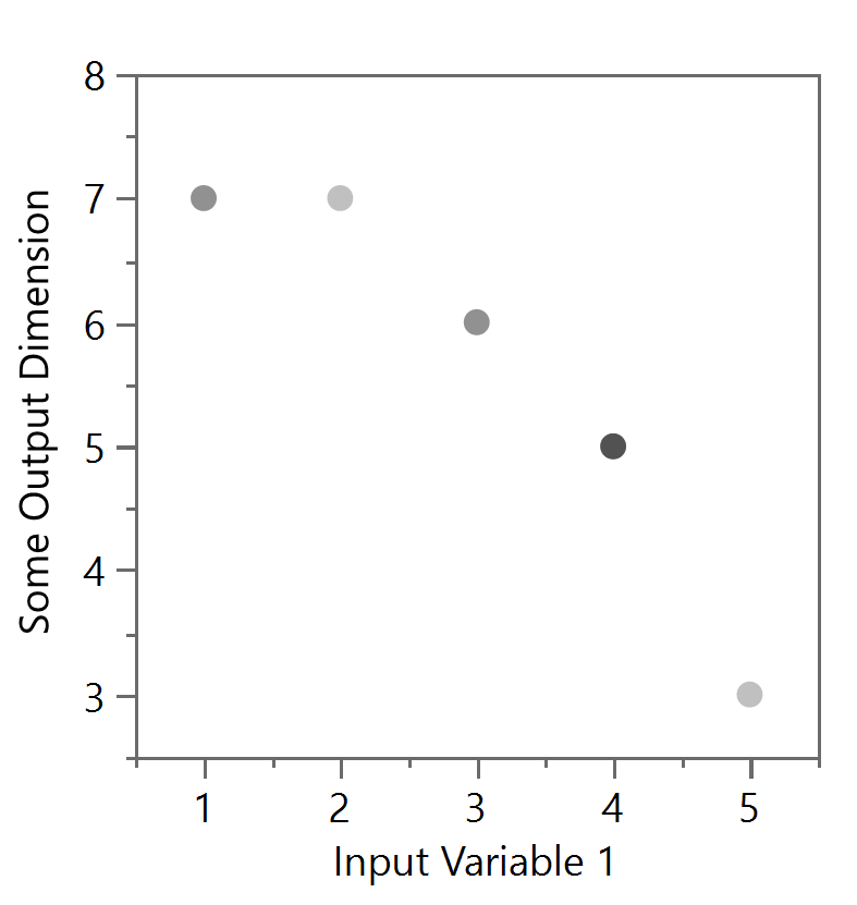
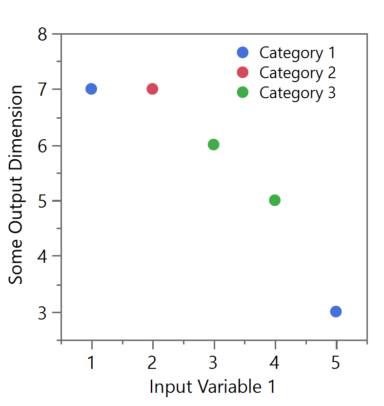
Figure 10a and 10b
However, using data “jitter” can be a good way to spread the data out and show how many points actually exist at the one spot. But be warned, this jittering of the data will physically move the data points and thus remove the overlap, but the detailed analysis of these points’ positions should now be avoided. The jittering process can be based on a random normal distribution as shown in Figure 11a or performed in a more organized configuration like in Figure 11b. Both remove some, or all, of the occlusion but with additional difficulties. Figure 11a still has some occlusion at the points near (3,6) and (4,5) and could be further adjusted with other techniques (i.e. transparency or point size) above, but there is still the potential of misinterpreting the data by thinking the data are at those precise locations (e.g. the location of (3.8, 5.2) after jitter, etc.). The example in Figure 11b is sometimes better as the reader is less likely to believe the data points took on such an organized orientation, suggesting to the mind that the data is in fact all found at the position of (4,5), for example.
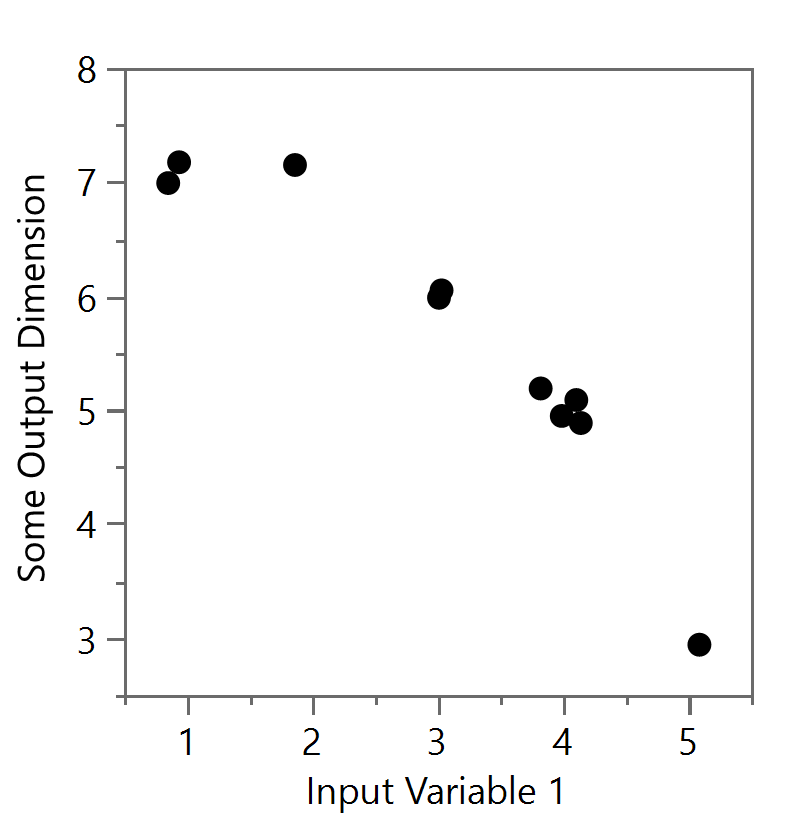
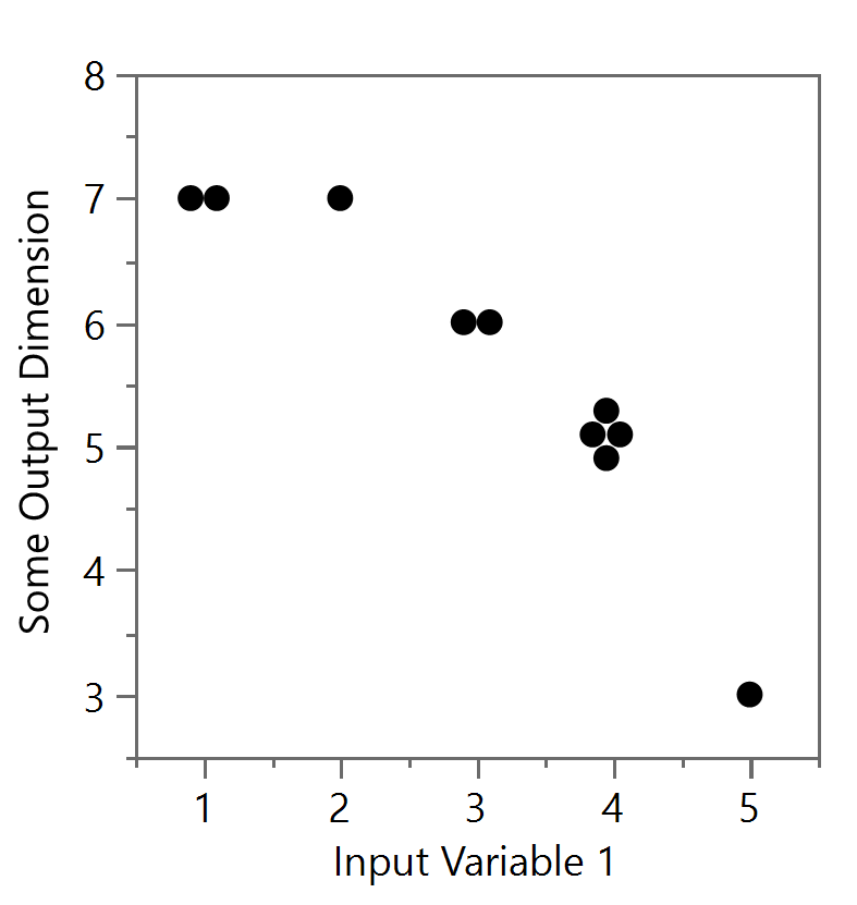
Figure 11a and Figure 11b
With a lot more data, the packed jitter (Figures 12a) or positive gridded jitter (see Figures 12b) versions can started to leak into the next value, so be careful with jitter methods as well. In particular, the positive gridded jitter (Figures 12b), starts from the lower left data point (for the true value) and then adds other data points above and to the right. Note that eventually the top row of the (4,5) group can be at the bottom level of another group (i.e. (3,6)). The packed version (Figures 12a) can offer a spiraling technique around the true but has similar issues with a lot of data. Much of this will break down if the distributions start to run into each other and jitter will no longer become an option.
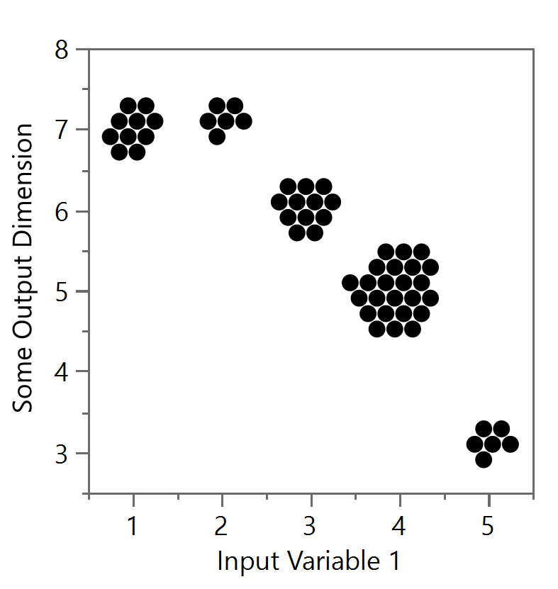
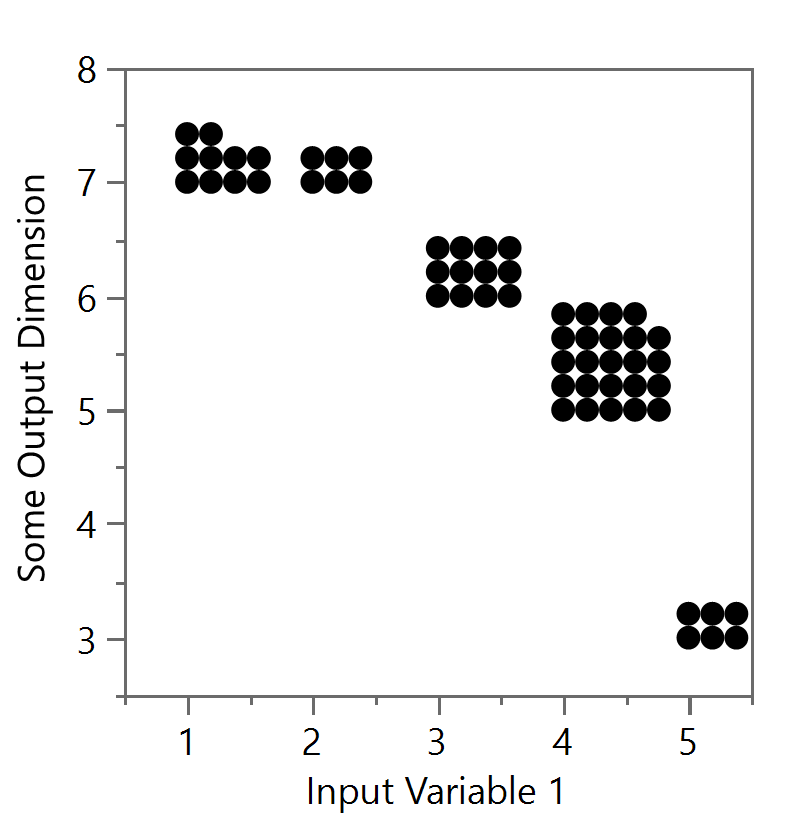
Figure 12a and Figure 12b
Ultimately, the technique employed to deal with occlusion will depend on how much and the type of data you have, the experience of the reader, the desired takeaway of the figure, and how much you are willing to describe in the text or figure caption. But regardless, the goal should be clarity and avoiding confusion as much as possible. Hiding data, even accidentally, can be at best misleading and at worst, dishonest.
To cite this article:
Salmon, John. “Design in Data Figures: Dealing with Occlusion.” The BYU Design Review, 27 May 2020, https://www.designreview.byu.edu/collections/design-in-data-figures-dealing-with-occlusion.