
Quaker Oats and The Design of Everyday Things
A Story about an Engineering Graduate Student Eating Breakfast
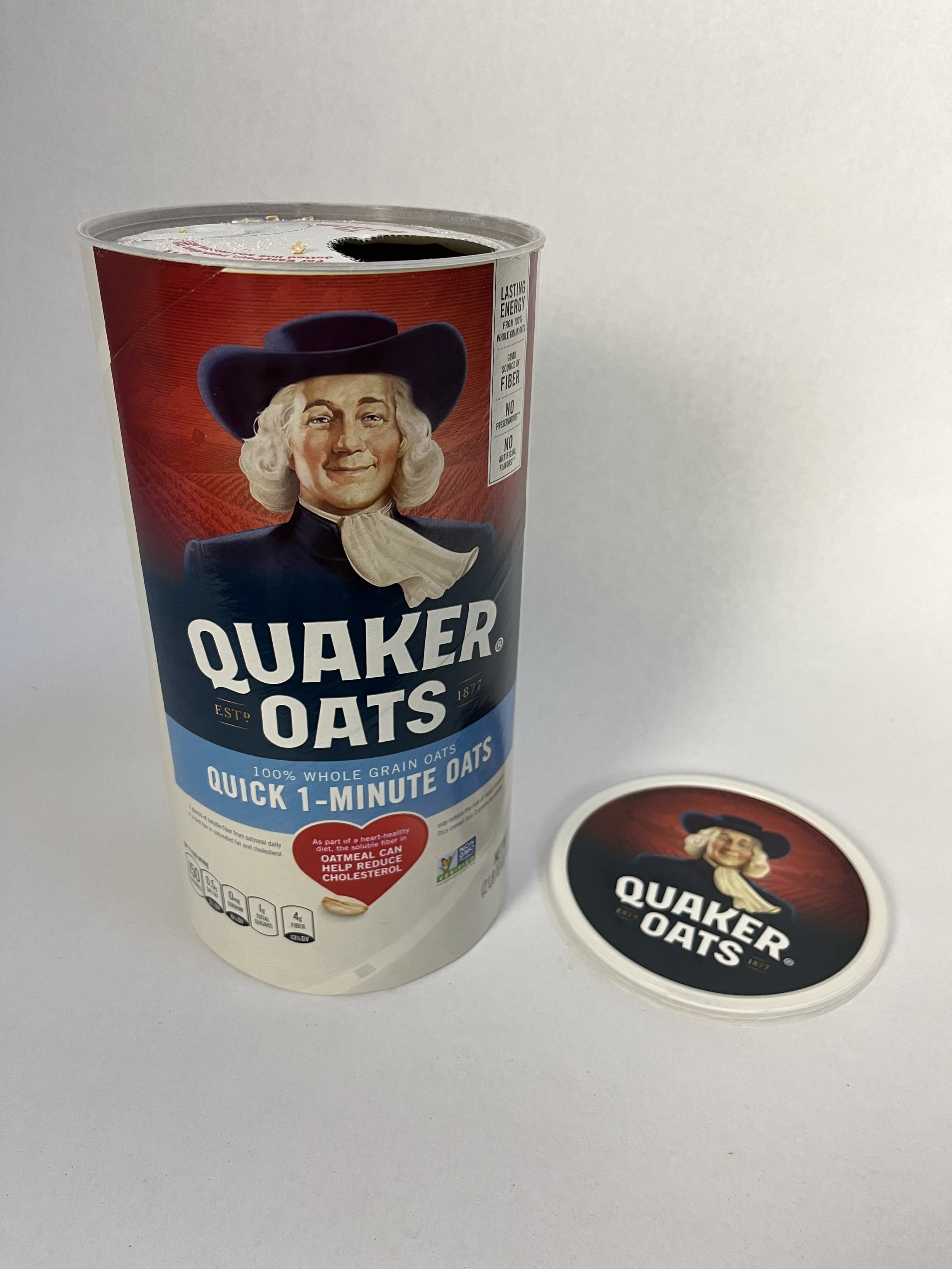
I was in a rush to make breakfast one morning. As I went to open my new container of Quaker Oats, I was startled by a bunch of red text glaring at me. Why do I need instructions on how to rip off a paper film? But I stopped to read the instructions.
To POUR: For EasyPour, push along ONE dotted line and remove paper.
To SCOOP: To fully open, pull the plastic ring around edge.
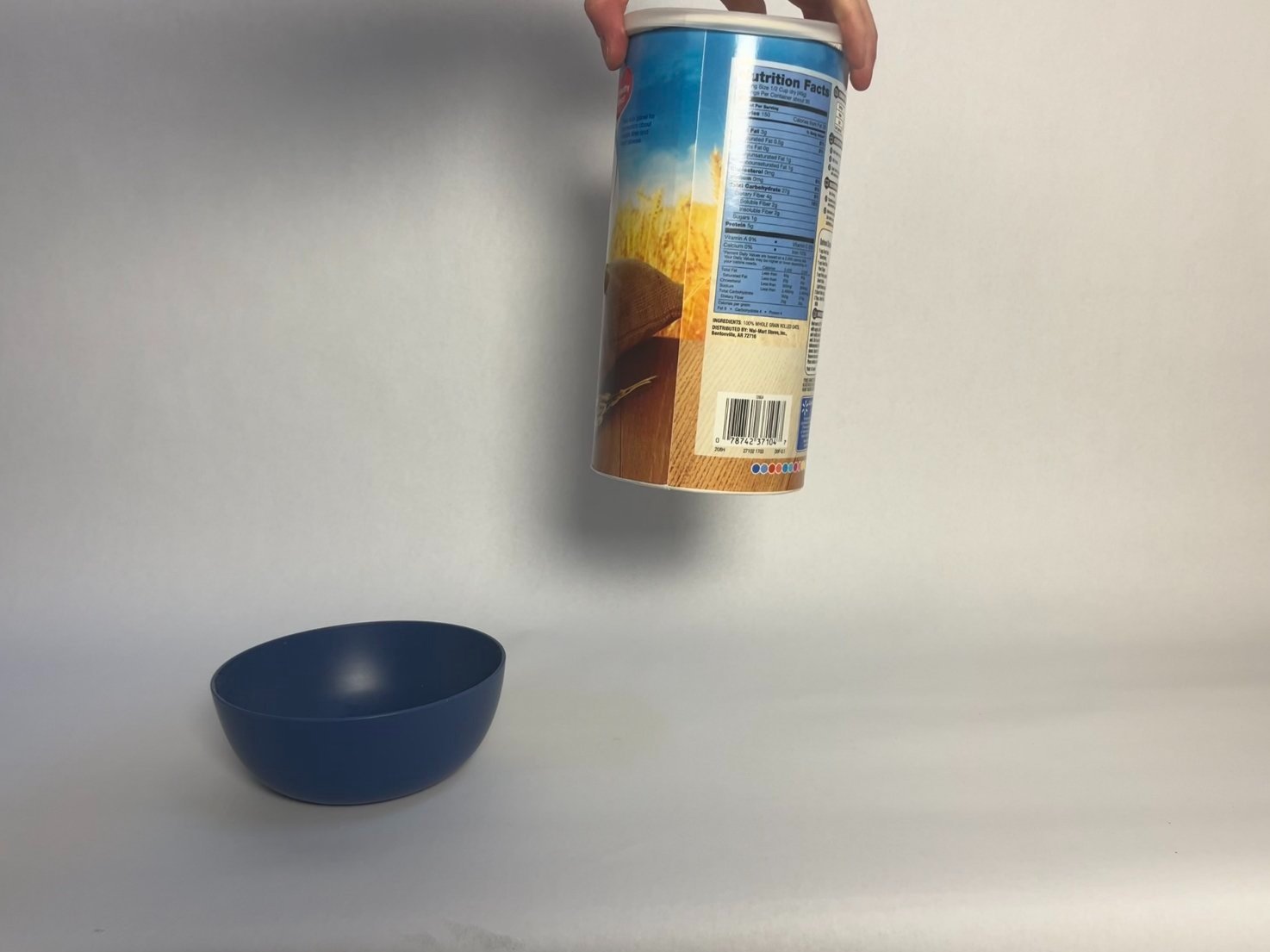
At first, I was annoyed - why is someone telling me about a new way to pour oats? I cautiously began to poke at the perforated lines. Sure enough, the tab came out. Next, I cautiously poured the oats into my bowl. And I loved it. It poured just like I pour my cereal!

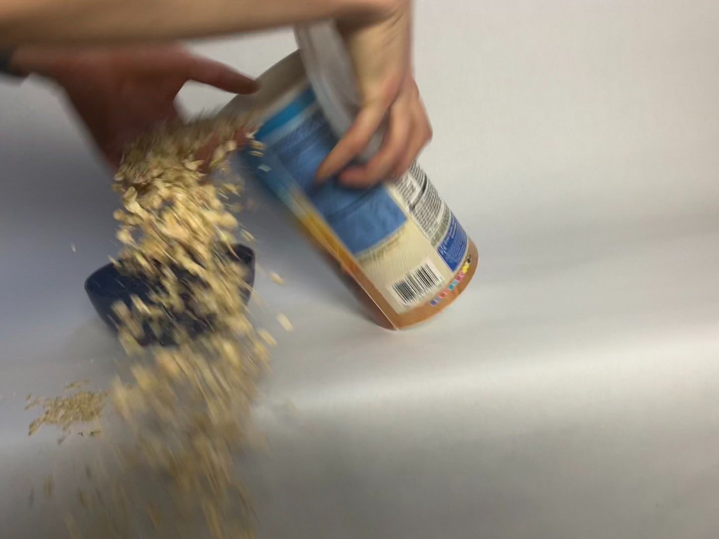
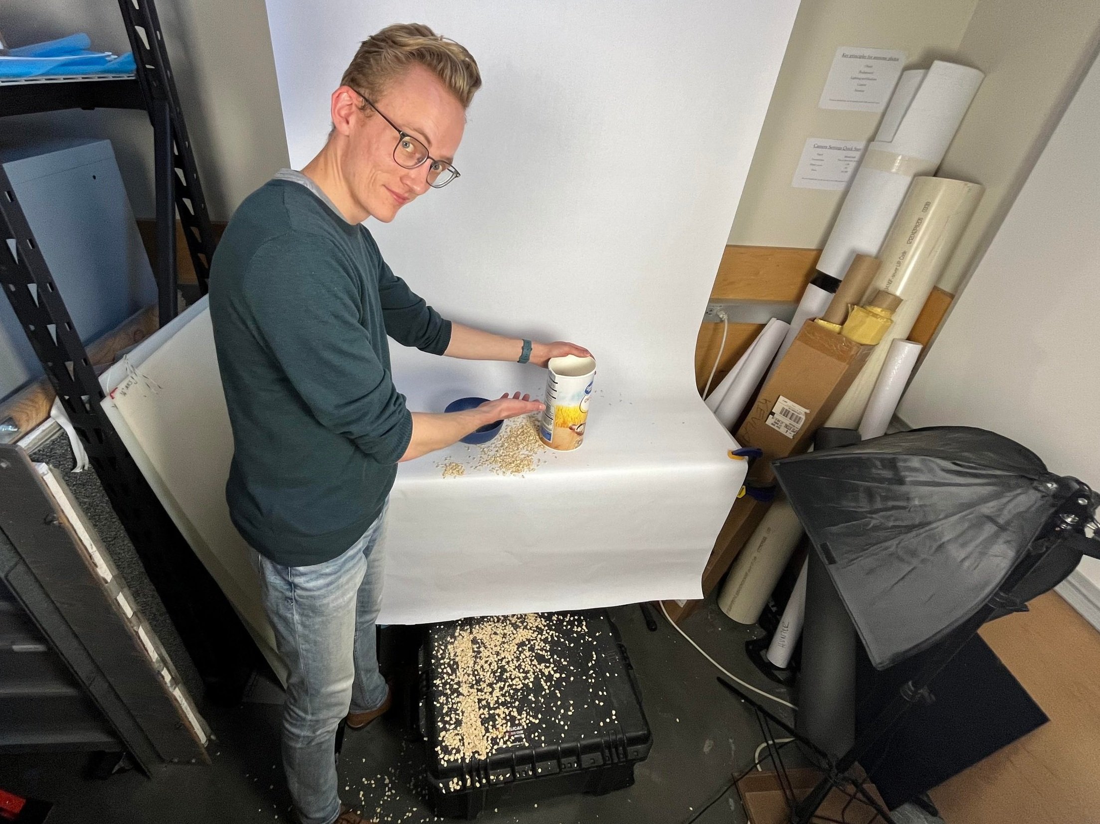
In the past, whenever I had poured oatmeal, I would have to be really careful about not over pouring, or spilling oatmeal off the side, because of the wide brim. Sometimes, I would crease the container to make pouring directly into my bowl easier. You wouldn’t think this should be a problem. However, often I go to grab the container of oats from the top, and on multiple occasions I’ve had the entire container fall out from under my grip while holding it. Crumpling the rim, while improving pouring, compromises its strength and ability to be picked up from the top. In fact, in trying to take pictures of this problem… I accidentally repeated it! The container fell and its fall spilled oats all over my lab’s photo booth. I then had to awkwardly explain to my lab mates what was going on.

What I felt that first morning - and every morning since making oatmeal for breakfast - was the satisfaction of a product behaving the way I wanted it to. Pouring my oatmeal with the little tab popped out was much nicer than my previous efforts of bending the container or being careful not to spill anything. Honestly, this was a problem that I didn’t even think was worth solving. But now that there was a solution in hand, I was loving it.
The Design of Everyday Things
These days I find myself eating Quaker Oatmeal a lot more often. Sometimes I think about the design team that made this innovation happen. I imagine that there were UX designers, people with a marketing background, some graphic designers, and some sort of manufacturing/tooling expert to design the perforation and put the new seal into the main production line. How did they realize this was a problem? How many ideas or iterations did they have until they settled on this one? How did they test the design? There is a story here that I wish I knew.
It’s an interesting design challenge - the user has to be introduced to the design, understand how it works, and then decide to try it out on their own, all within 2-3 seconds. Any longer than that, and the customer is upset that their breakfast or baking has been delayed. Note how with my experience, I was already in a rush and went from annoyed to pleased in about that timeframe.

A favorite book of mine on design
Now, the stakes may be low just for an oatmeal container. And pouring oatmeal is quite a simple task to begin with. But let me ask you - how often have you been angry with something that should be simple to use but just doesn't work? Push/pull doors, appliances, containers, are more confusing than they should be. Why should something as simple as a yogurt container or tin can be annoying to use? Don Norman, an engineer turned psychologist and designer, wrote about these frustrations - and how to avoid them with good design - in his book The Design of Everyday Things [1]. His intro to chapter one may hit home:
If I were placed in the cockpit of a modern jet airliner, my inability to perform well would neither surprise me nor bother me. But why should I have trouble with doors and light switches, water faucets and stoves?
Norman also wrote, “Good design is actually a lot harder to notice than poor design, in part because good design fits our needs so well that the design is invisible, serving us without drawing attention to itself.” I’m going to draw on some principles from his book to justify my unusual excitement for an oatmeal container:
The Design was Intuitive
It was easy to figure out, and it was easy to use. A few of Norman’s “seven fundamental principles of design” are especially relevant here:
Discoverability - “It is possible to determine what actions are possible and the current state of the device.” In this case, everything was clearly labeled.
Affordances - “The proper affordances exist to make the desired actions possible.” The perforations made it possible for the tab to be punched out.
Signifiers - “Effective use of signifiers ensures discoverability.” The red font made this pretty clear. However, a piece of feedback I would have suggested, maybe an arrow could have pointed at the tab, or the tab could have said “push here.” However, this is minor feedback. I think the signifiers were sufficient for me to figure it out quickly enough.
Constraints - “Physical, logical, semantic, and cultural constraints guide actions and ease interpretation.” The new paper seal made the oatmeal container more akin to something I was culturally familiar with: cereal boxes. Logically, pouring oatmeal like pouring cereal just makes sense.
The Design was Innovative
Innovation has been defined as “the act of creating something useful at the right time that did not exist before.” I’m not trying to say that this oatmeal container is as innovative or life changing as running water. But it is useful! It came at the right time, and I had never seen it before. In this case, the design chose to tackle a business problem - how might we sell more oatmeal and increase profits - from a human centered vista. Somewhere at Quaker, a team had the insight to realize that people will eat more oatmeal if eating oatmeal is easier or more enjoyable. These designers easily could have said, “we don’t need to solve this problem. It’s human error that our customers are spilling their oats everywhere.” But consider this insight, once again from Norman:
Engineers still tend to believe in logic. They often explain to me in great, logical detail, why their designs are good, powerful and wonderful. “Why are people having problems?” They wonder. “You are being too logical,” I say. “You are designing for people the way you would like them to be, not for the way they really are.”
The designers at Quaker Oats created this container to be used the way “I really am,” so to speak. Someone who pours oatmeal. As a result, I felt like someone actually cared about my breakfast - that’s innovative enough for me.
A Small Critique
There is one thing that I do not understand, which is why the “To Scoop” arrow does not line up with the pull ring.

Albeit confusing, I am not too concerned about this. Pull rings have been around for a very long time. I was happy that it was still included in the container, because I imagine that many people want to scoop oats (maybe for more controlled measuring or baking). The container still accommodates that preference and tries to signify that the option is available, even if the arrow is not pointing at the right spot. I imagine this would be quick to figure out, and hopefully it is a quick reorientation fix on the manufacturing line to make sure the confusion is eliminated.
The End
For all the designers reading this, what can you learn about design from the Quaker Oatmeal container? Start by asking if your products are this easy or intuitive to use. Can someone figure it out in the manner of seconds, without a user’s manual? If you need a user’s manual… really, why?

Choose to innovate the little things. Find the tiny human centered problems you have the power to make better. If you keep up at it, you’ll make someone somewhere smile. And just maybe, some nerd on the internet will love it so much that they write 1000 words about it.
References
[1] Norman, Donald A. The Design of Everyday Things. MIT Press, 2013.
To cite this article:
McKinnon, Samuel. “Quaker Oats and The Design of Everyday Things.” The BYU Design Review, 5 Oct. 2023, https://www.designreview.byu.edu/collections/quaker-oats-and-the-design-of-everyday-things.


